Bastion
Overview & Challenge
Most apps and e-readers are focused on one thing, trying to shove thousands of years of printed reading into a device as is. I don’t think it should be this way. The novel is purported to be over 400 years old, but the way we read today is not. Yet, books and narrative worlds are still presented the same way. I was interested in how design can help try and make reading in our world today better.
Role
Bastion was a self-initiated project in which my roles ranged from everything from managing the product development, to user experience and user interface design to outreach and public engagement. In short, I did just about all of it except the actual coding.
Results
Bastion is a way where you can explore a story world, choosing how you read through lots of things happening all at the same time. You can read all the way through one point of view of whats going on, or maybe you just want to find out what happened in a particular place. It’s up to you how to explore and read.
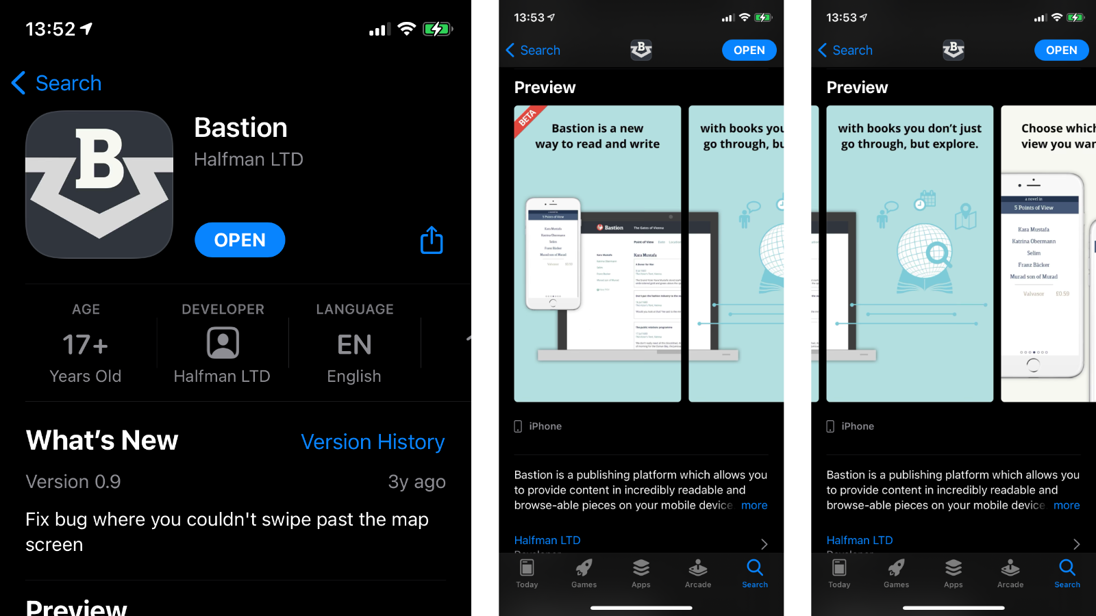
Bastion was a publishing platform you can read and provide books in incredibly readable slices on mobile devices.
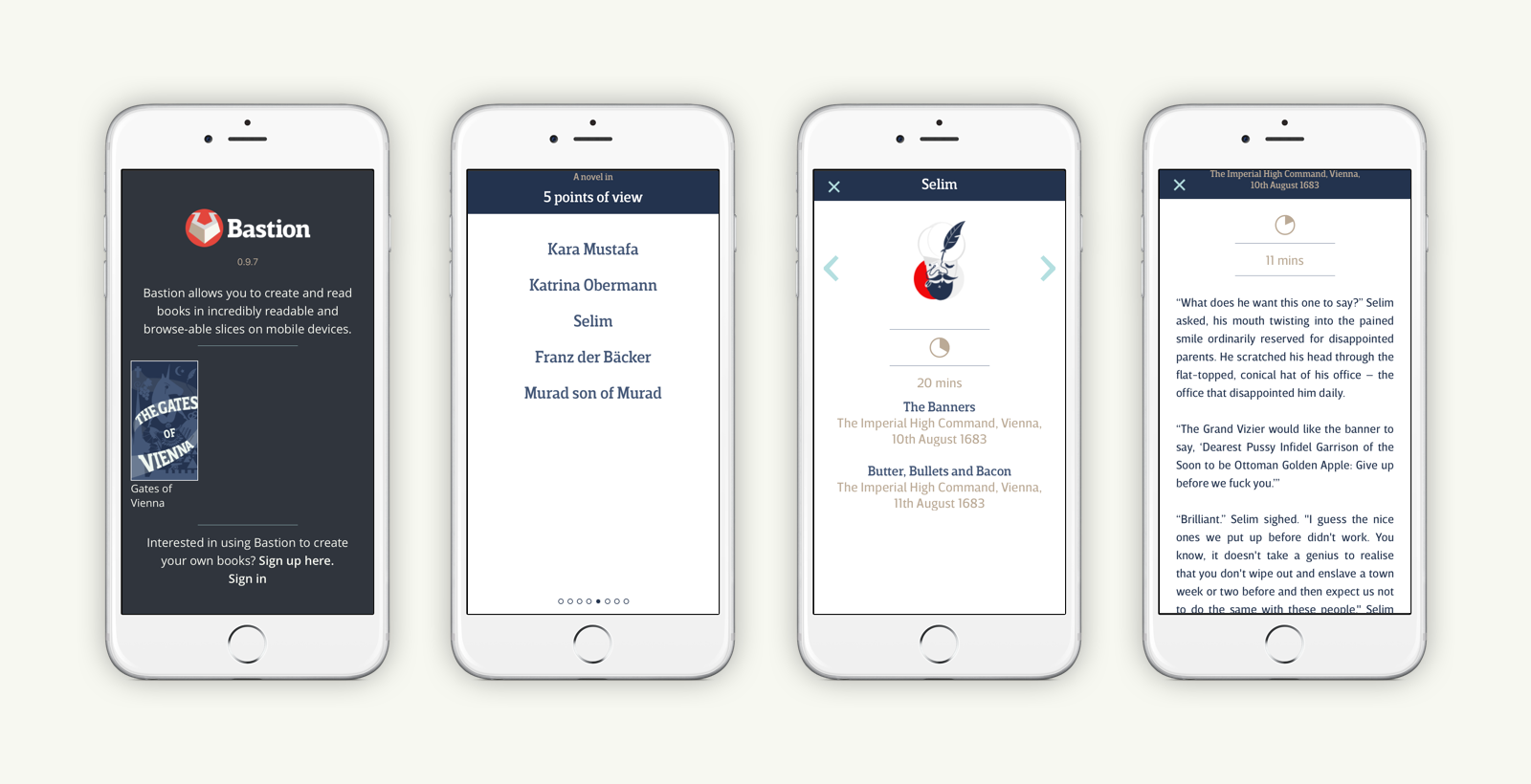
Bastion is a platform where the reader can choose how they want to read, choosing either a point of view…
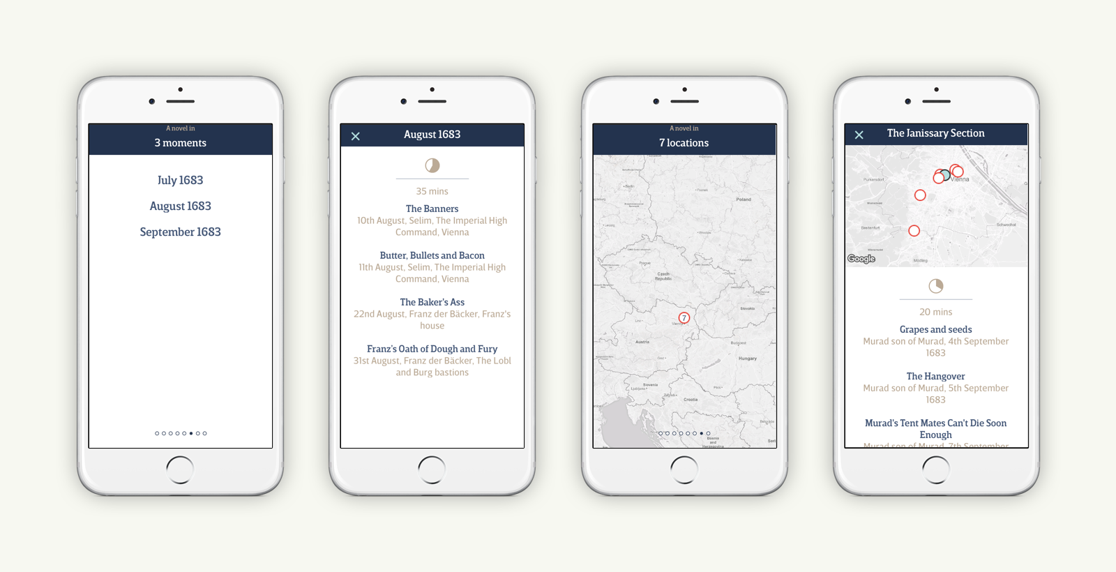
…or time, or location on a map.
There was a content management system where authors and editors could work together to publish on the Bastion platform, creating successive versions of their books which they can keep on expanding and growing in points of view, times and locations. This published the book versions to the mobile app that was available on the iOS App Store.
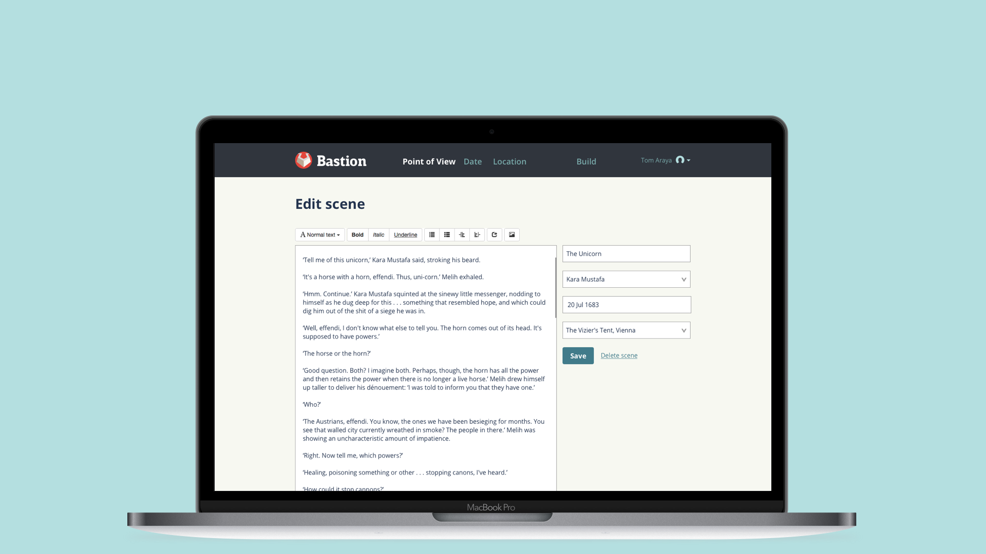
There were designs for analytics for the platform, designing a way to see what works for readers and how, looking at how we’ll read each scene, point of view, etc. are.
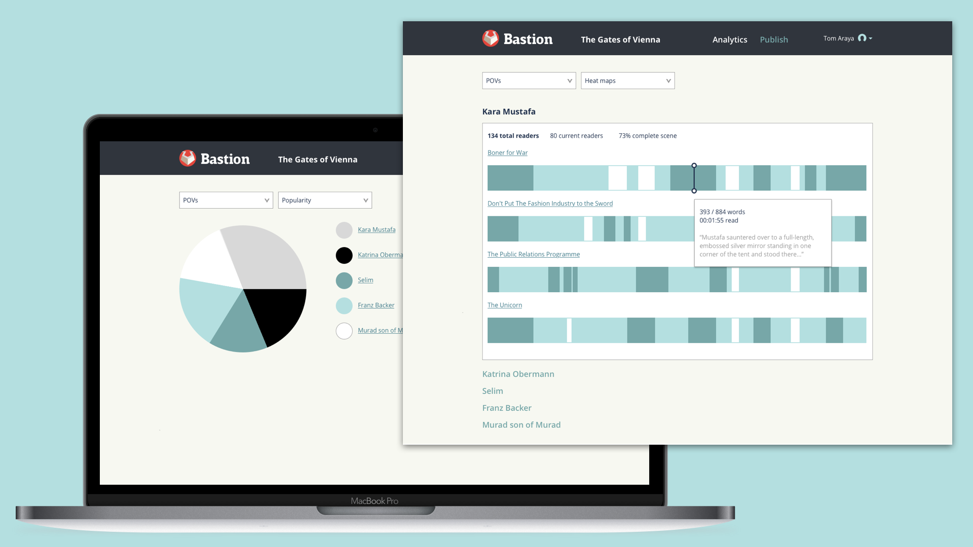
Bastion was live on the Apple iPhone App Store from 2017-2020.
