Google Compare
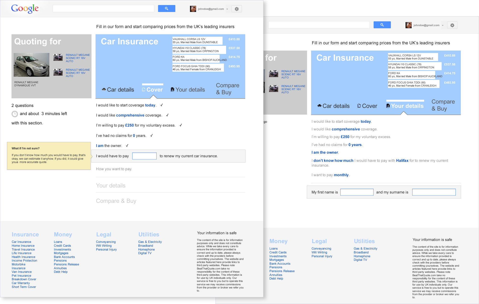
When you’re shopping for the hard things in life, like car insurance, forms should be as painless as possible, that means making assumptions for the overwhelming amount of people and telling them how much longer they have.
Life is full of hard things like mortgages and insurance. Google Compare was a way for people to look through the confusion around financial products, including credit cards, mortgages and insurance policies, and give overwhelmed people the comfort and means to make the big decisions in their life.
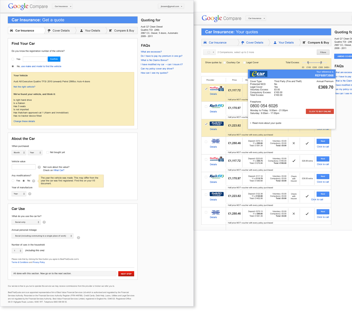
Working with industry experts and alongside researchers we developed requirements for users for the product to be launched and tested. Car insurance was the initial product to be launched and we did a lot of design and work around how to best inform the user whilst they go through the process whilst also making it not look scary.
In the initial concepts, we worked alongside the team developing the Kennedy design system, the precursor to Google Material Design, to create standards and patterns for user forms.
Through feedback we began to develop an alternate approach, breaking conventions to give users in difficult and stressful situations ways to feel better about what they were doing, not just be informed. For instance, one thing we found was that these sorts of users never know how much more work they have, so we tell them about how much more time it would take.
We also looked at making the form as simple and quick as possible by creating a number of typical assumptions for the overwhelming amount of would be users, for instance that they’ve never had an accident and are the owner of the vehicle.
Google Compare was live 2012-2014.